Kleyo
Co-founding & growing a social commerce app from initial idea to a £5M valuation.
The context
Needing to prove commercial traction for our investors
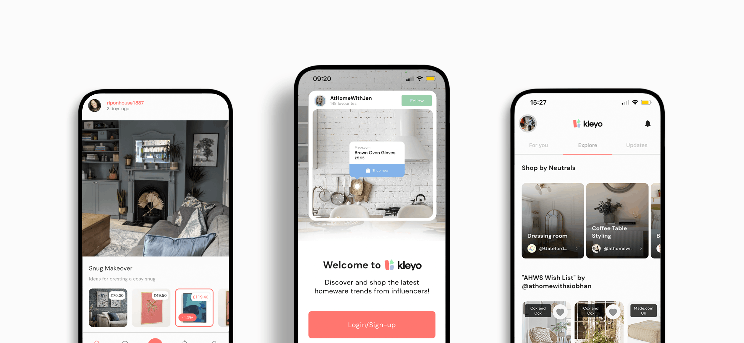
Just before COVID first hit in 2019, I co-founded a social-commerce app called Kleyo, which allowed users to discover and share their favourite homeware products with their followers.
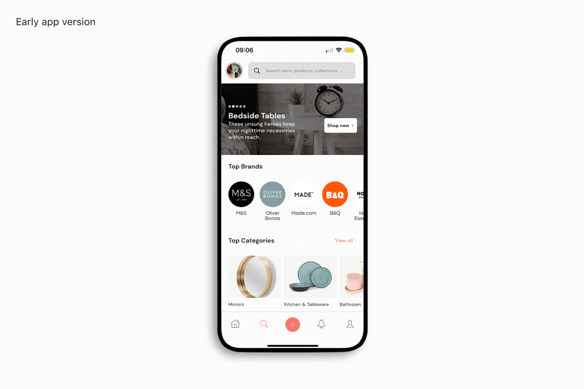
Off the back of our initial £250K fundraise, we’d pivoted numerous times, been selected for Stripe’s mentorship programme, and most importantly built the first shippable version of our app. However, our investors were pressuring us to prove commercial traction as soon as possible.
The good news was that we were rapidly increasing the number of users we had on the app, but our revenue wasn’t following suit and it eventually started to plateau. As a result, we needed ways to increase our revenue and there were a few key metrics that we wanted to measure as these were some of the most important figures that’d help to move the needle.
We wanted to increase: 1. our conversion rate to 1%; 2. our average order value to £375; 3. our DAU/MAU to 10%; 4. and finally our average revenue per customer to £15.
Discovery
Discovering the root of the problem
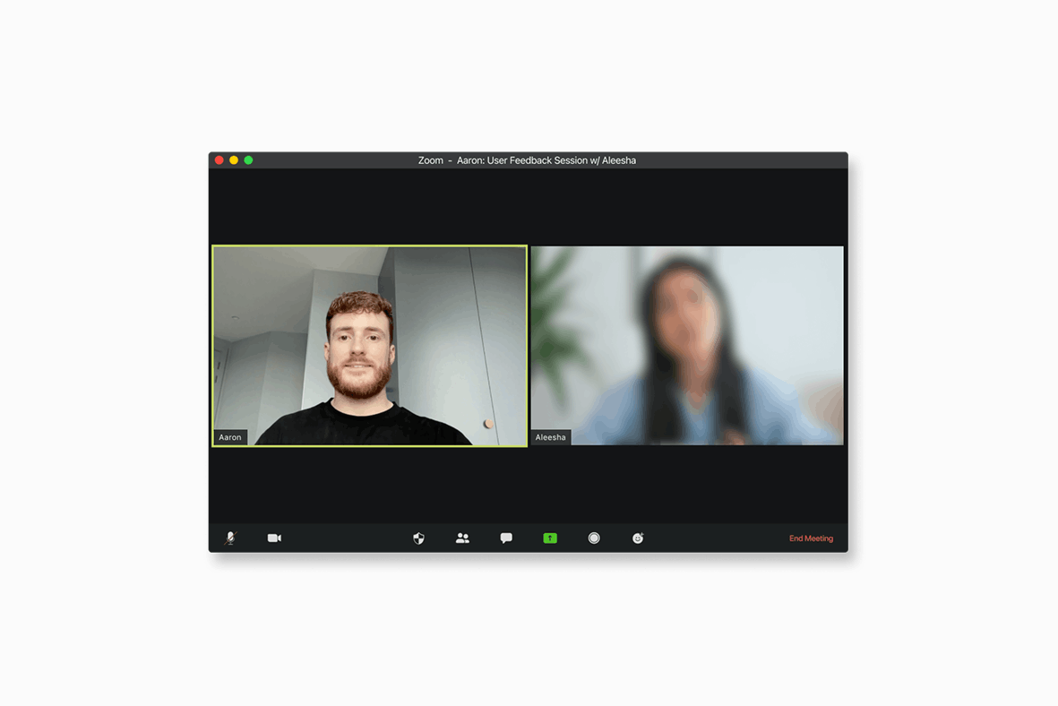
In order to begin improving our app, I knew that we needed a better understanding of what it was that our users wanted from the app. I wanted to find out their current frustrations with the app, what they needed from us, why they used or didn’t use Kleyo as well as any other similar apps that they were using instead of ours.
The first port of call was to set up interviews with as many of our users as possible – and these came from both the creator side, as well as regular consumers. Now off the back of these, there were a few things which stuck out and kept being repeated.
Firstly, creating collections was too arduous and took way too long. We also had a catalogue of over 1M products at the time, and the choice was far too overwhelming. And also, users were unsure why they’d shop at Kleyo, instead of going directly to the brand that they were interested in.
I also conducted some wider research into how creators and consumers were currently operating in this space and what they were using; again, I noticed a few trends along the way. Firstly, creators didn’t tag all the products in a photo, which was annoying for consumers. Secondly, consumers wanted a more tailored approach to shopping, something more personalised around their individual taste. And lastly, it was incredibly hard for small creators to monetise their content.
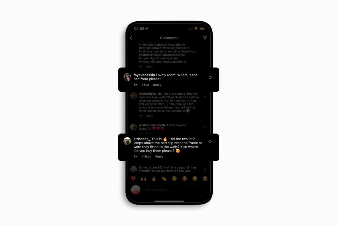
I then went deeper and looked into what our competitors were offering – and at the time there were 4 main ones. 21Buttons was more fashion-focused and relied heavily on the creators tagging all of their products. LikeToKnowIt was one of the leaders (although moreso in fashion) but alienated smaller creators and was still too arduous. Pinterest was amazing for inspiration, but very hard to monetise at the time, and not everything was shoppable. Then finally Instagram; again it didn’t really cater for small creators, and at the time – pre-Instagram shopping – that side of things was much more of an afterthought.
Off the back of this, I knew that there was definitely room for improvement on what these companies were offering. I then wanted to look into some data around the current app and so focused on a few key flows that were brought up in the earlier user interviews. So for example: number of searches before clicking into a product; time taken to create a collection; time taken to share a collection; and also the click through rate on products from collections.
Definition
Defining the problem(s) that we wanted to try to solve
Just to expand on our users a little bit more – there were 2 broad use cases that we were focused on initially. The first of those being what we called the shopper; this user wanted to find inspiration and buy homeware products to furnish their home with, usually on a relatively low budget. The second being the creator; this user was a content creator (sub 25k followers) who had a loyal following and wanted an easier way to share their homeware finds with their followers.
After collating all of the insights through testing and user interviews we now had a strong understanding of where the product was currently lacking and which areas could be improved upon.
For the shopper it was clear that they loved the idea of being able to shop by creators’ homes, but there was too much content being served to them that wasn’t relevant. They needed to be able to filter by their preferences and find products directly from an image, and be incentivised to do so. For the creator they also loved the idea of being able to share their favourite products with their followers, but it wasn’t immediately obvious how to do so, or how much they’d actually earn from doing so either.
So, off the back of all the signal which we’d received, it all fell into three buckets or themes, and this is essentially what we wanted to focus on when working on solutions.
Firstly – users wanted more personalised product recommendations being served to them to match their taste and they wanted to find similar items based on that. We also noticed that they put a large importance on shopping by style rather than brand loyalty, and price also played a big role; a lot of users said they could be swayed by discounts or incentives. And lastly, the app was just too slow in its current state – creators are inherently time poor, and so they ended up using other apps or websites to carry out their tasks.
Testing & learning
Trialling new ideas
To round things up – the 3 key areas which we wanted to address in order to improve our product were: Discovery, Shopping, and Sharing.
I went back to the drawing board and started to play around with ideas which we could potentially implement. After speaking with our CTO to align on which could be viable from an engineering perspective, I then sought initial feedback from some of our power users to get their thoughts as well.
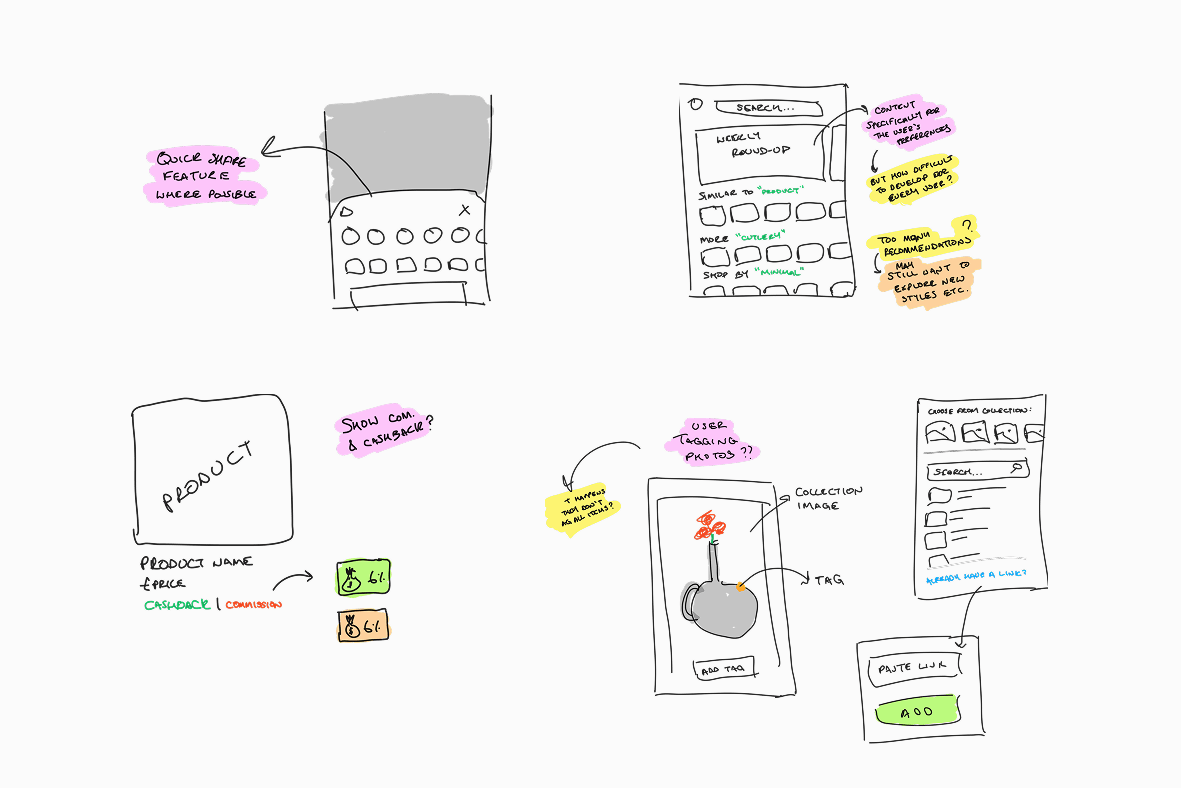
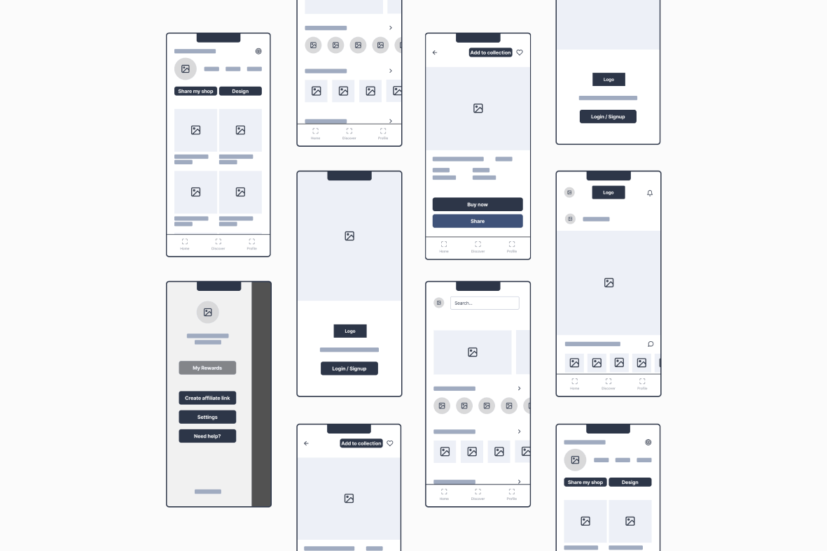
Once we had a grasp of how users felt towards some of those new ideas, I began fleshing out the relevant flows and journeys across the app and moving them from wireframes all the way through to high-fidelity prototypes.
So, before we deployed these into the live product, I conducted another round of testing with some of our users. Some of the new screens and flows hit the mark, whereas some still needed a bit of tweaking. For example: shoppers & creators didn’t know which symbols were intended for them & some of the language caused feelings of distrust – such as ‘cashback’. Secondly, providing the shopper with absolutely everything from a creator’s image was a step in the right direction, but still too overwhelming for them. And lastly, people cared about things such as ‘values’ in principle, but not if it meant missing out on their ideal piece of furniture – causing added frustration to their journey.
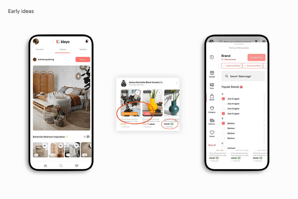
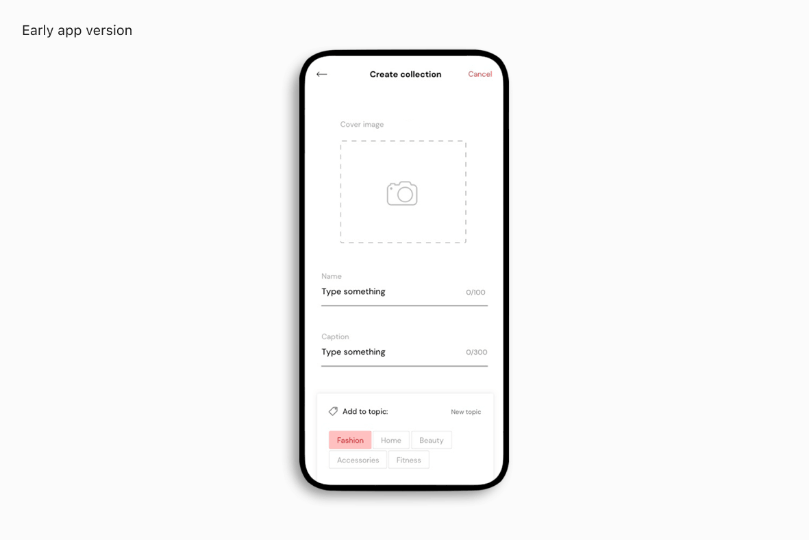
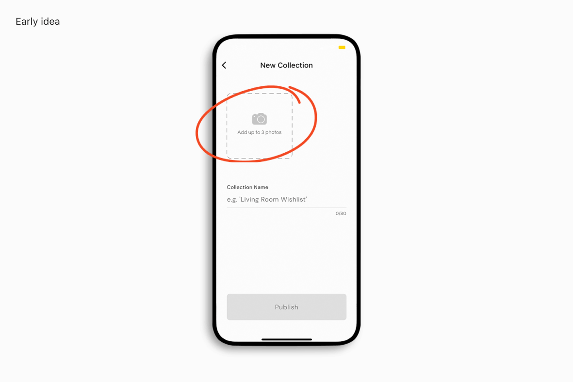
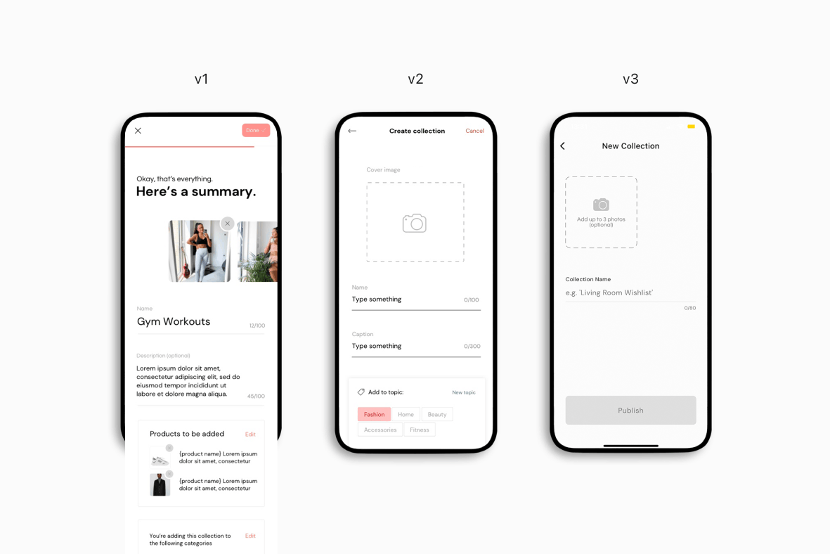
We also found a large roadblock in the create collection flow which was causing a massive drop off. We were requiring the user to add a collection image, but if they didn’t have one to hand, they were either having to use google to search for one, or even worse some would just give up and abandon the flow altogether.
Chosen solutions
So, what changes did we make?
We’d now fully understood the root of the various problems which existed, and had spent some time trialling new ideas and iterating on those as we received more signal. So, what did some of those chosen solutions actually comprise of?
01
Streamlining collections
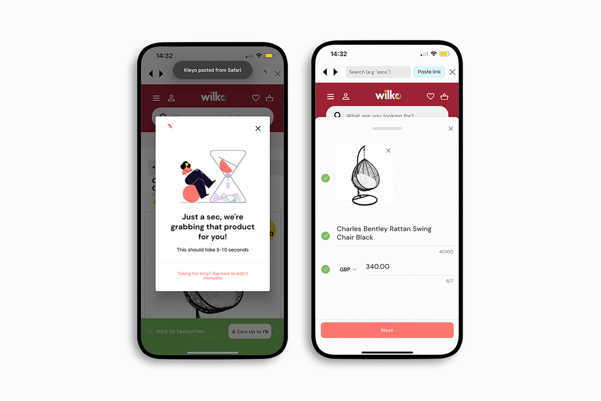
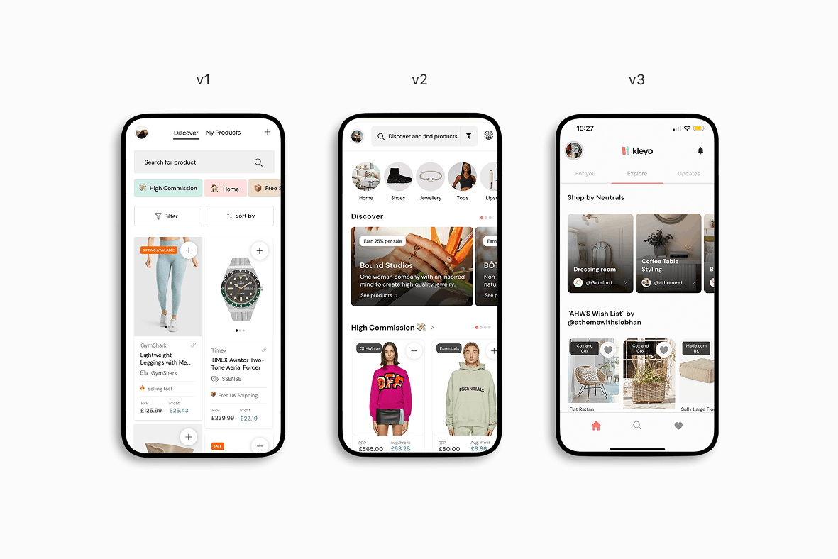
The first solution that we settled on and implemented was to streamline collections. We removed unnecessary fields and reduced the workload when creating a collection – now it only required a title. We also created an automatic page scraper, which removed the need for users to spend time manually inputting information when creating a user-added product – all they had to do was paste a product link and we would do the heavy lifting. All of these improvements resulted in 3.4x as many collections being created per user.
02
Product detection using AI
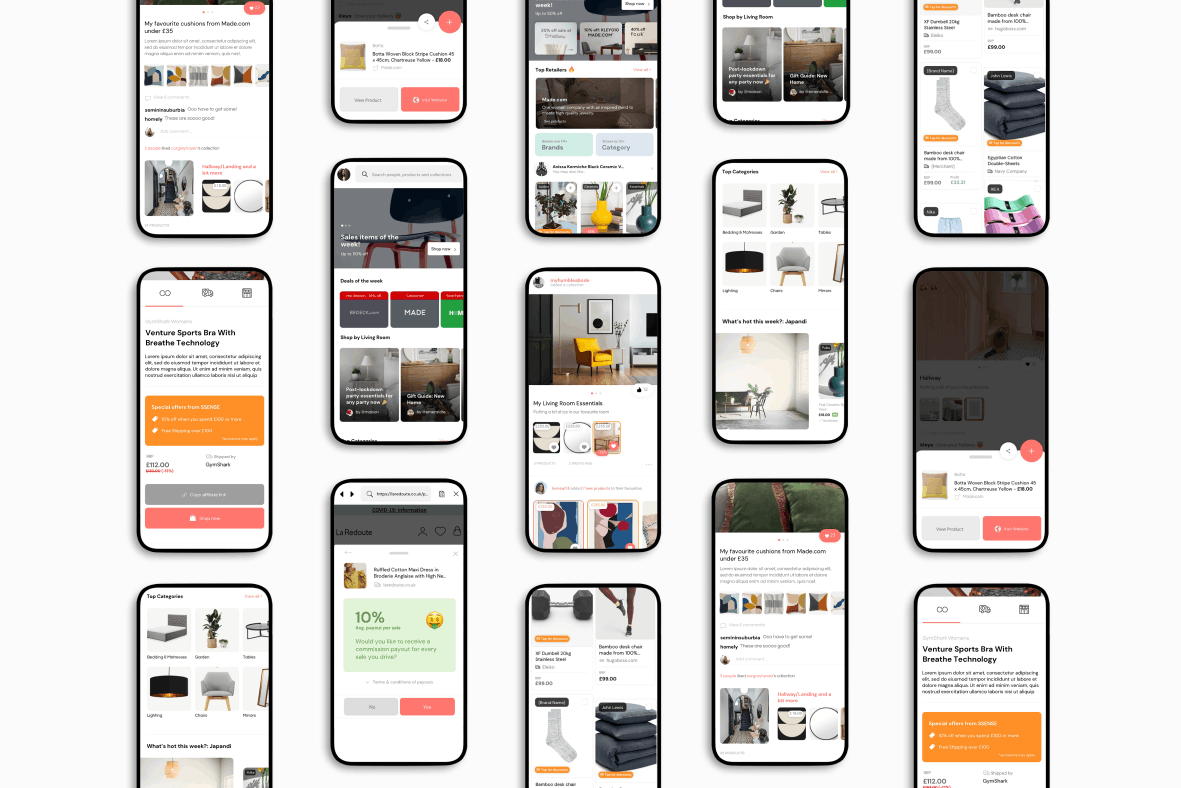
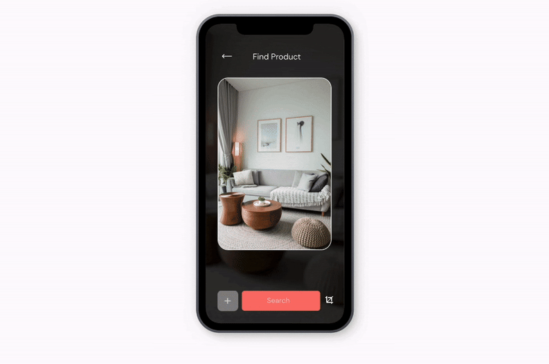
We also introduced a new product detection tool. Before AI was as readily available in product tools as it is now, we leveraged the Google Vision API for its speed and functionality; it made everything instantly shoppable. You could upload your own photos or scan creators’ images to instantly shop every product in the image with our live crop feature. This also removed the onus from the creator; it was another step we took to reduce the burden and the time it took to create a collection.
On the backend, we’d find the closest match from our catalogue of over 1M+ products to surface to the user, and we’d have full control over the order in which these were shown. This meant that we could tweak the order based on things like relevance, brand partner, or even commission levels.
03
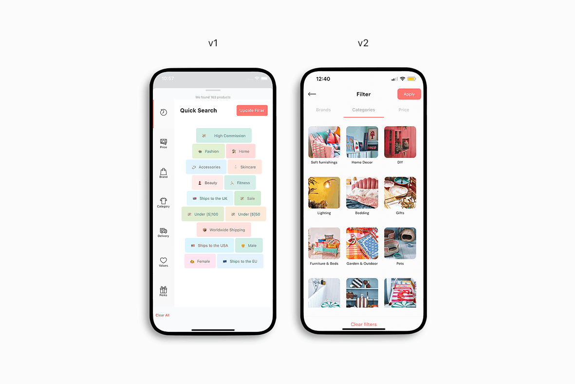
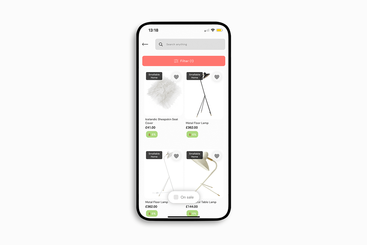
Incentives & overhauling filters
We also completely overhauled our filter system, placing more focus on styles, product types and price, with a much cleaner layout. We also introduced cash rewards, giving users more reason to shop with Kleyo after finding a product they were interested in. This resulted in a 41% uplift in clickthrough rates from filter results, to product listing pages.
04
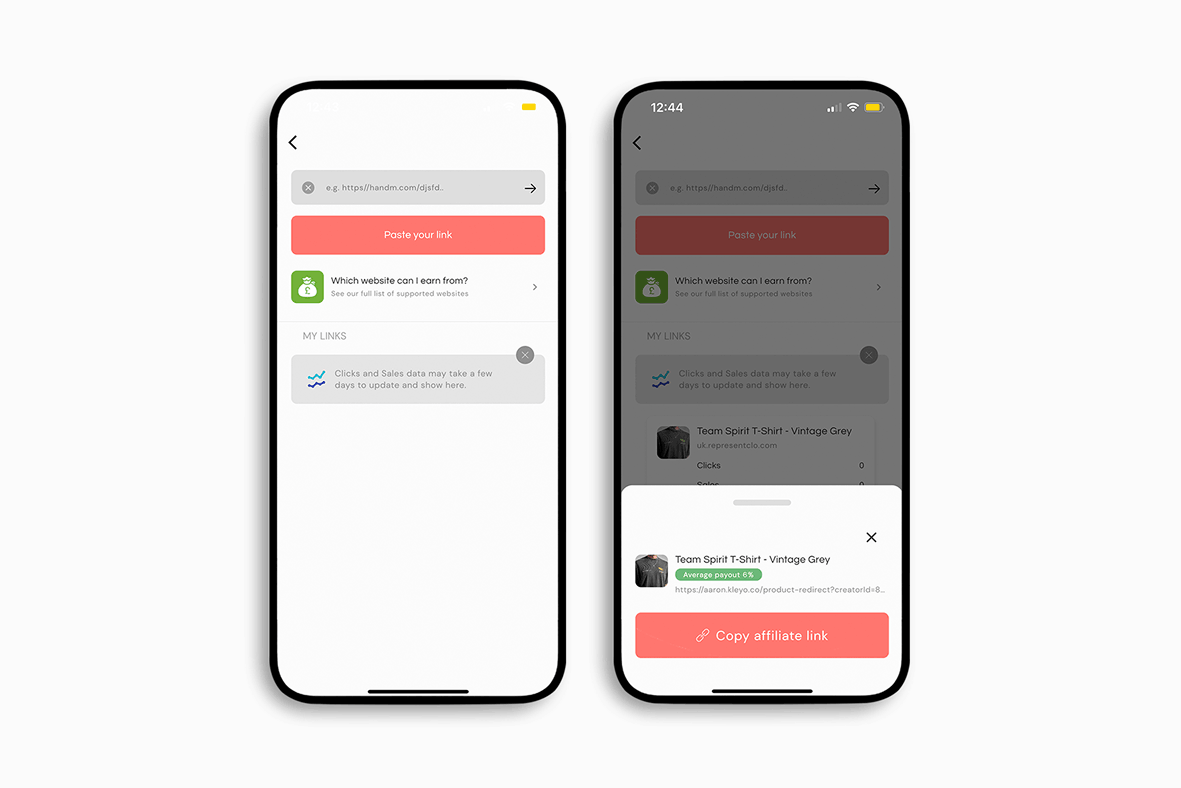
Increasing the speed of creating affiliate links
Another improvement we made was to increase the speed of making affiliate links for our creators. Previously you had to add a product to a collection in order to share it, but this process wasn’t optimal as creators didn’t necessarily want to add all of their products to a collection. So now, all you had to do was paste a link and we would automatically turn that into a shareable link for them in a few seconds. We also made it super clear what the average commission for that product would be, as soon as your link was ready to copy. This all combined to result in a 220% increase in how many shareable links were generated per user.
05
Making shoppable content more tailored
Finally, we made our content much more personalised to each user. We tailored the content around what the user was actually interested in, surfacing content from creators that they had previously interacted with, as opposed to singular products. This change contributed to a 62% increase in clickthrough rates from the explore page to either product or collection pages.
The outcome
How was our performance against our initial KPIs?
So after continuing to monitor, test & iterate on the new updates & features, how did we perform against our KPIs that we set at the very start?
Starting with the conversion rate – we managed to increase this from 0.2 to 1.2%; our AOV increased by over 20%, from £290 to just over £350; our DAU/MAU increased from 7.1% to just under 9.5%; and our average revenue per customer increased by just under 80% to £16.
