AXA IM
Redesigning AXA’s global Investment Managers platform
This project was undertaken whilst working with the great team at Pattrn Studios
Bringing the platform up to date
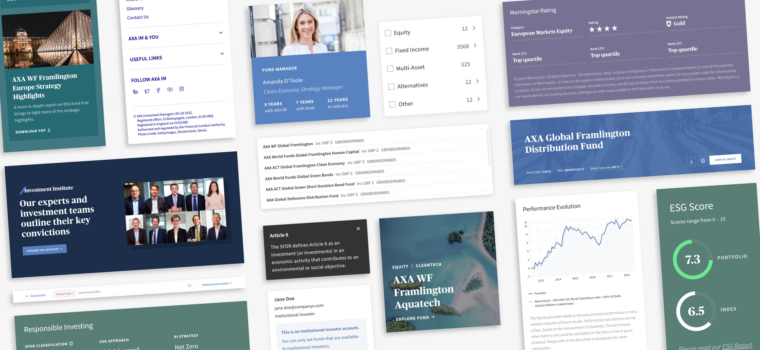
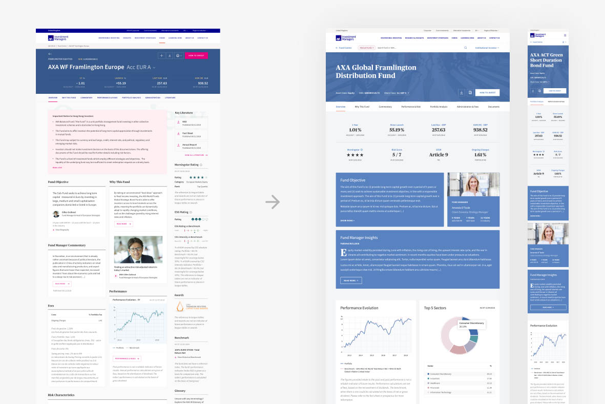
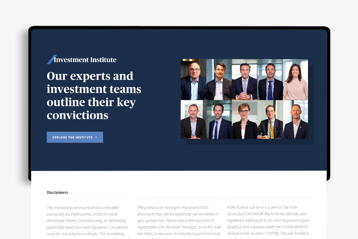
AXA wanted to redesign their existing Investment Managers (IM) platform to bring its look & feel in line with the rest of their website.
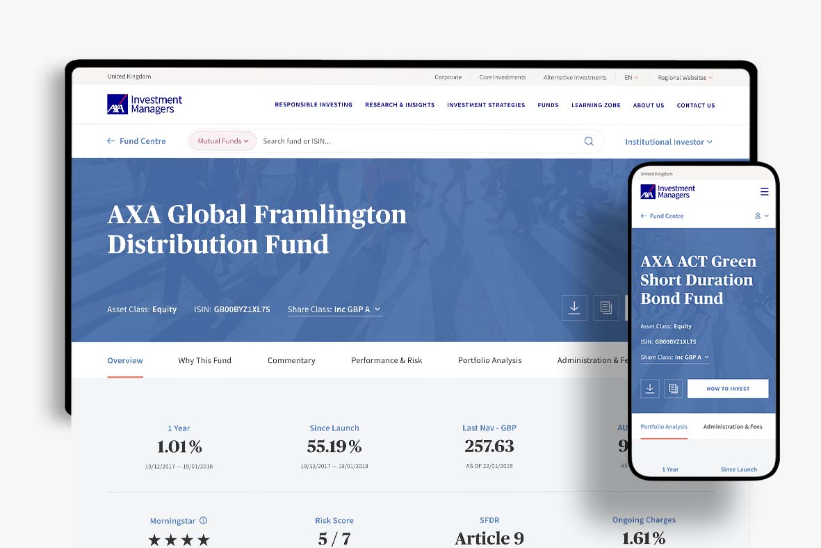
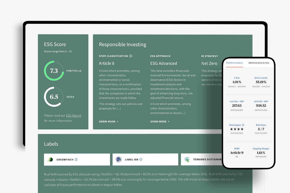
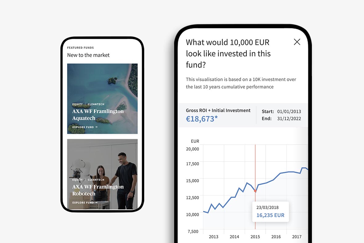
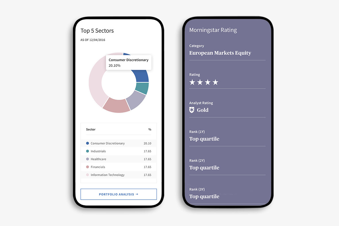
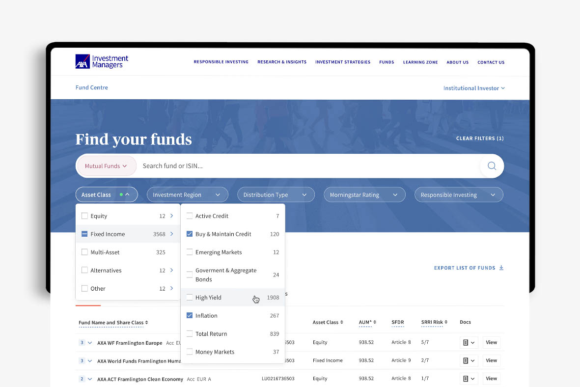
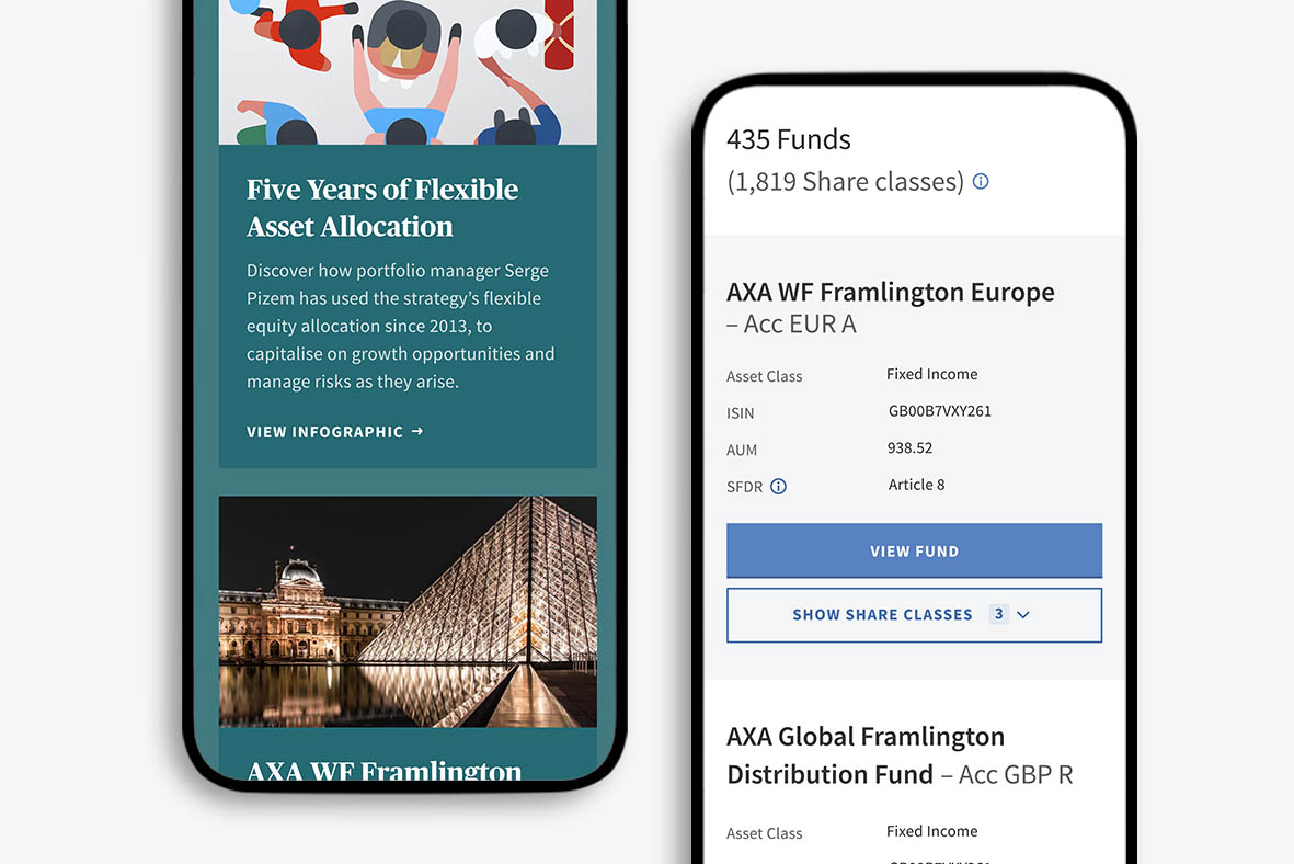
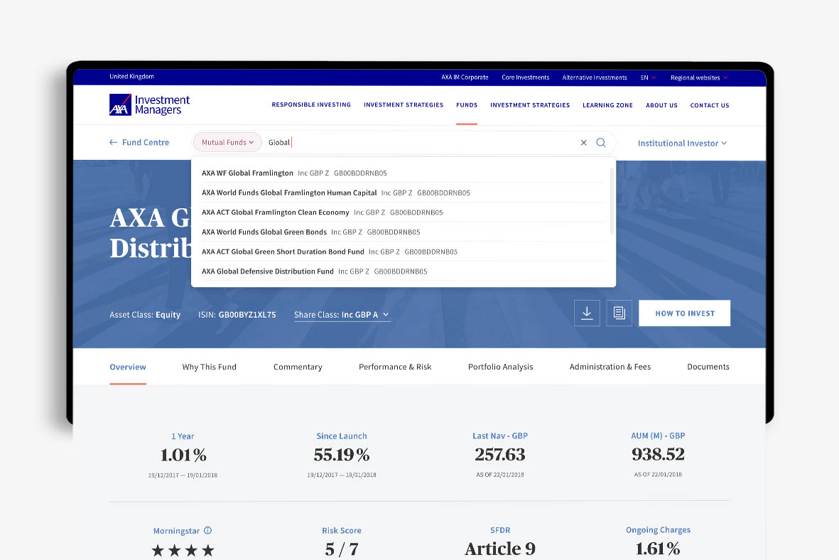
I took lead on numerous key features and pages in the user journey on the IM platform, namely the fund navigation, search & filter system, as well as the main fund overview page and a variety of secondary pages. I was also in charge of creating the brand direction for graphs, charts and tables.
As is the nature of investment platforms, we had to comply with financial regulations (often also varying between countries) which had some bearing over aesthetics (sizing, disclaimers etc.) as well as be cautious of the various different types of users that would be using this platform as each will likely have different expectations and level of knowledge of such platforms. For example, a retail investor would have vastly different knowledge from that of a fund manager, and so we had to be careful with how certain features were designed, or how much prominence something should or shouldn’t be given.
‘The future needs better than business as usual’
How did users feel?
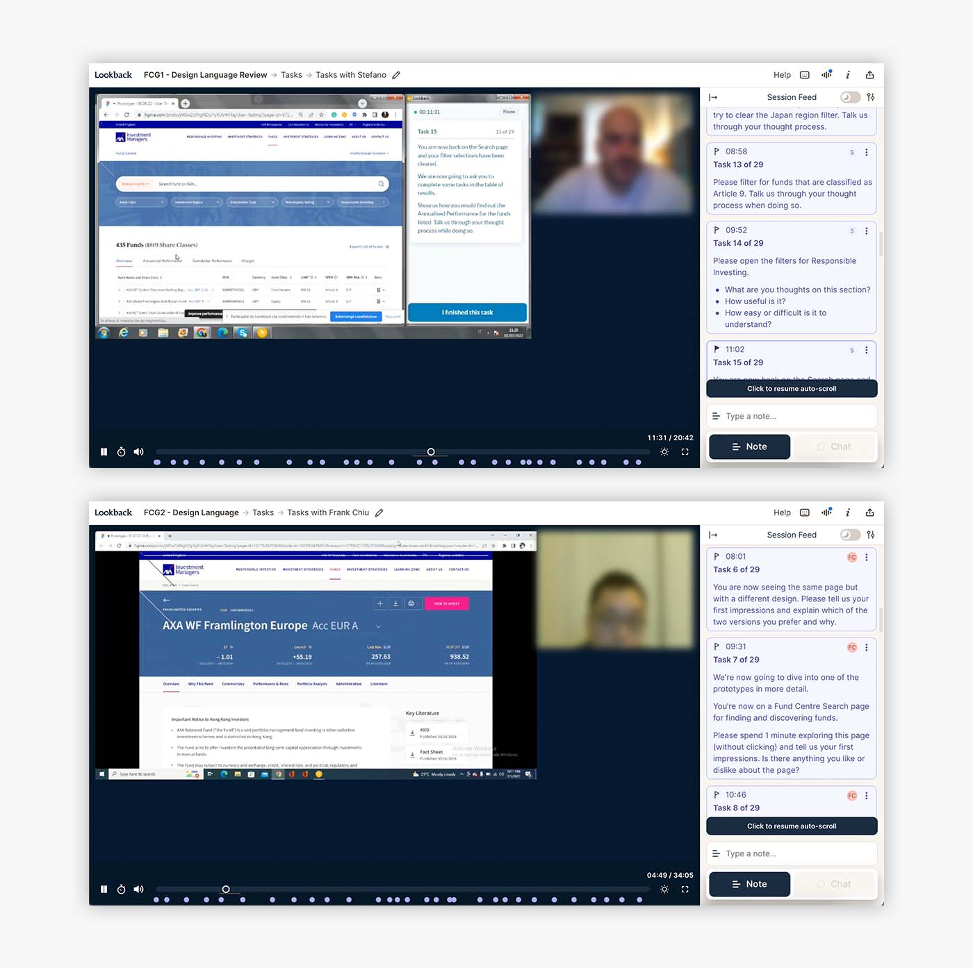
Prior to signing designs off, we first conducted user tests to understand how they felt about this new look.
We used Lookback to compare user’s experiences using the new & old version of the platform, in the hope that this would give us insight into what was working well, what could be improved, and what we should perhaps revert back to.
As the user sessions were unmoderated, getting the right mix of questions was vital. We kept some open-ended to understand their thoughts around the design or new features, whilst others were task-driven, measuring ease or speed of completing an action. This mix proved to be incredibly useful and the insights gained were acted upon where necessary.
The development handover
Once the designs had been confirmed, the handover process with developers began.
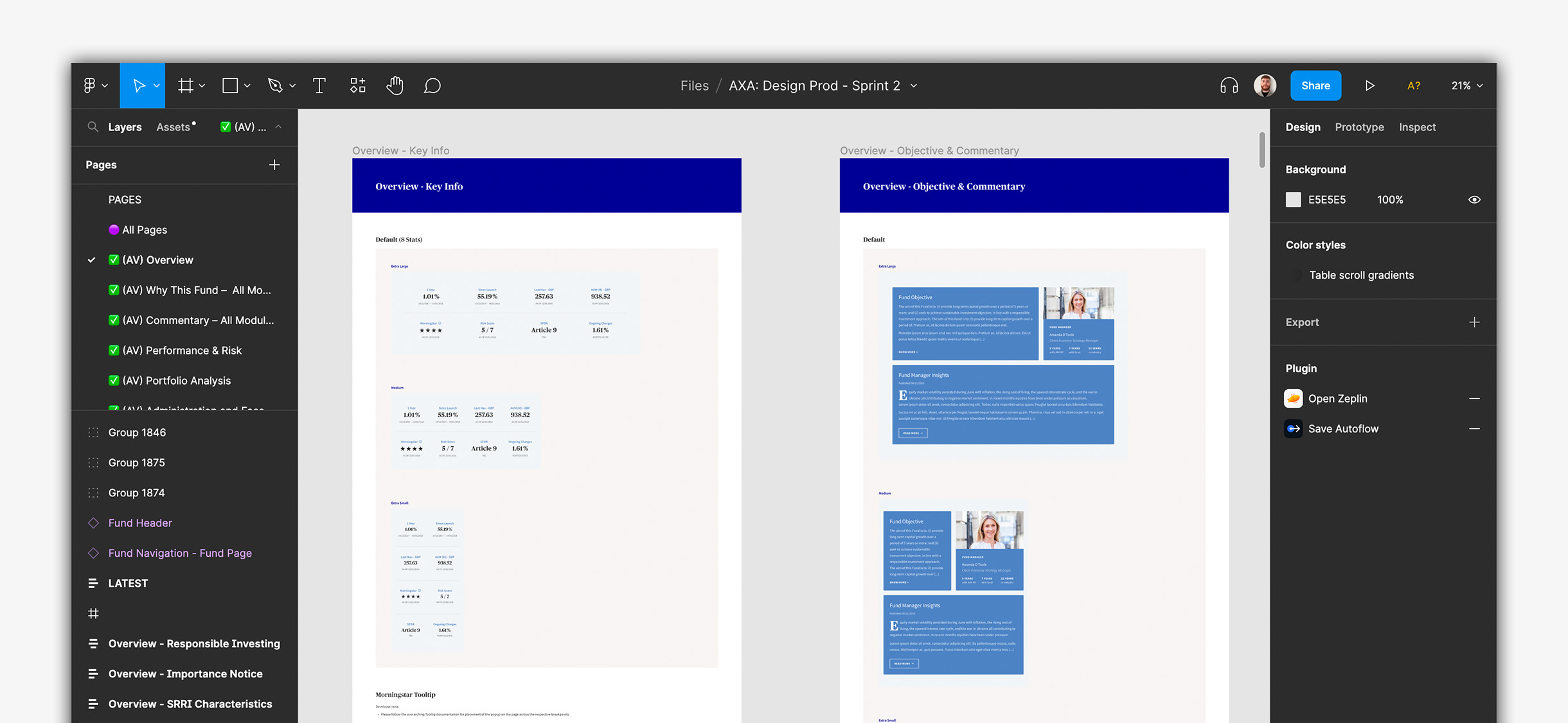
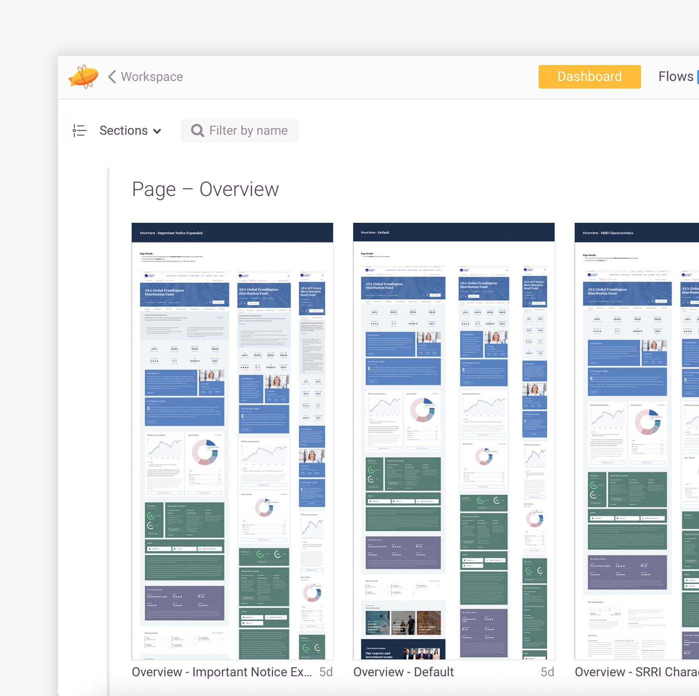
After making sure everything was pixel perfect, we documented our designs in Figma with any references and interaction notes on a module-by-module basis across breakpoints. We included full page views, along with alternate layouts where the default view was altered due to regulatory rules. We then exported this to Zeplin, which we regarded as our sole source of truth.
Following this, we held calls with the dev team to run through any questions they may have had prior to them starting the development process. These calls are essential to iron everything out and make sure all stakeholders are aligned on what is required.
Investment opportunities for everyone
Introducing ETFs to AXA IM
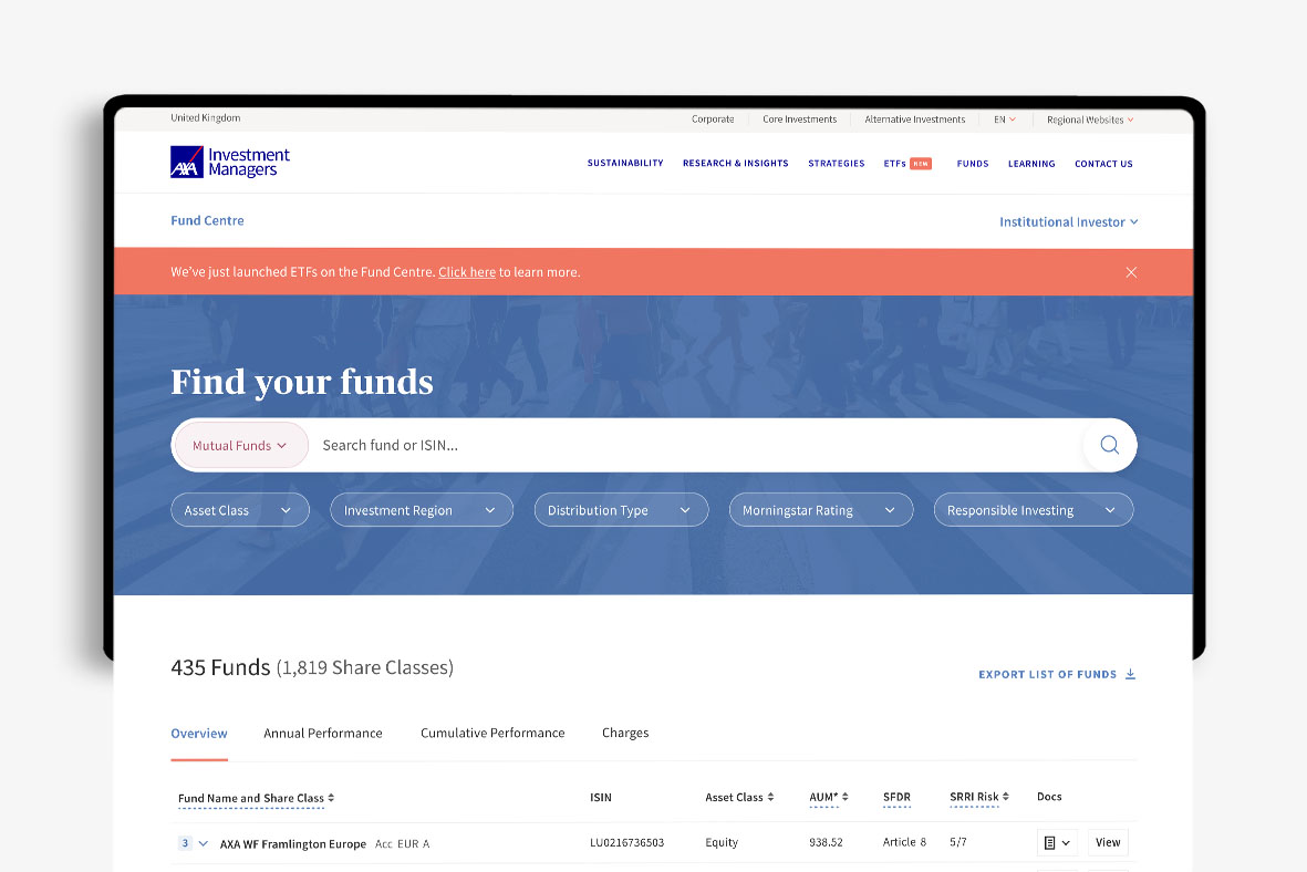
AXA were soon about to offer ETFs as a part of their fund catalogue and needed ways for users to find out about it.
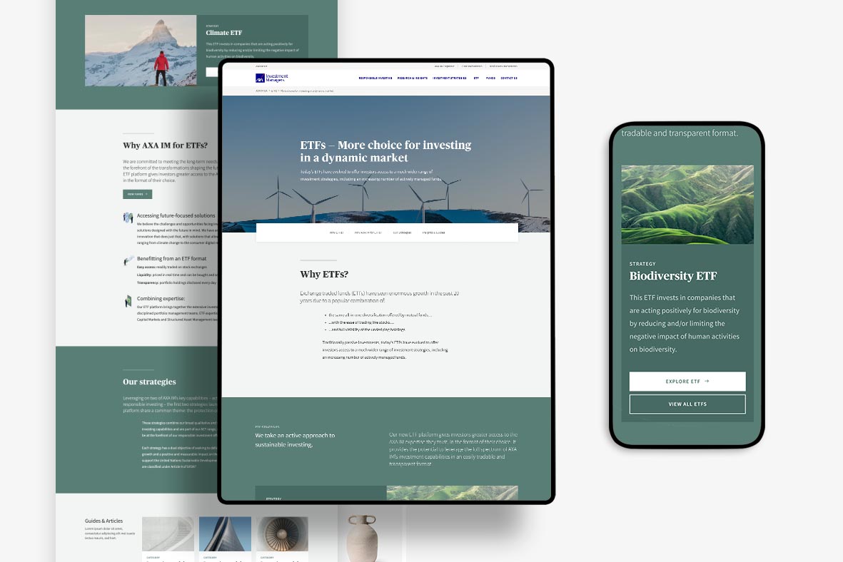
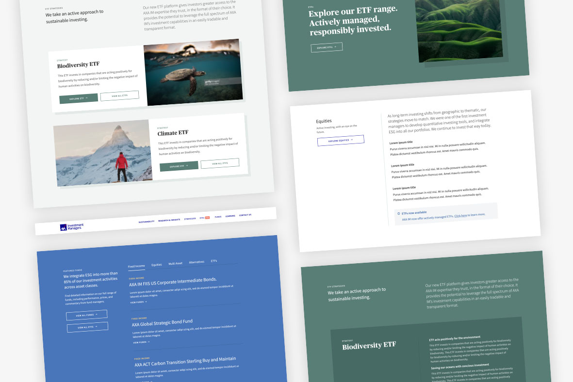
Our first port of call was to understand how AXA’s competitors positioned their ETF offerings, and so we did a deep dive into their websites to see what we thought was working well, and what could be improved upon. Off the back of this research and some further investigation into potential user journeys, we identified four ways that we thought could drive positive engagement: dedicated campaign pages, routing modules on relevant non-ETF service/campaign pages, navigation items and notification bars.
The challenge for us was to carefully balance the user intent and potential level of interest with the type of method that we used, and how it was used. For example, a ‘pop-up’ idea that we initially had would’ve felt too repetitive (especially for frequent users), and so something like a small one-time notification bar on the fund search page felt more appropriate. On the other hand, larger routing modules were a great way to capture interest on relevant service pages and full dedicated ETF pages then provided in-depth information for users who were actively seeking it.
Enhancing AXA’s navigation
AXA also wanted to alter their navigation menu across their AXA IM & AXA IM Core websites.
I took lead on both the design & functionality of this feature, as well as handling the demos and playback sessions with the AXA team.
The key challenge for this task was how can we introduce a sticky nav bar that improves the current user experience. This may sound simple in essence, but when working with an audience the size of AXA’s with multiple user types, and across numerous page types and structures, it required a lot of planning as to how this was going to function.
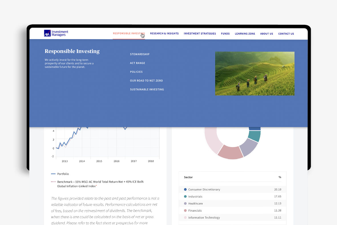
Overall, we wanted the sticky nav to feel like an aid, and not intrusive at all, so across the site we reduced the height of the bar when scrolling but retained the functionality of hovering over a menu item, which brings down the dropdown ‘mega menu’.
Similarly on campaign pages, we wanted to improve the helpfulness of the anchor links and so rather than them being an option that you can only click when you first land on the page (and don’t see again until you scroll back up), we also made these sticky, with an indicator underneath the links to let you know which part of the page you’re currently on.
The Core website presented another challenge with the introduction of a search icon, which when clicked on the sticky nav, would hide the other menu items and open out the full search bar.