Informa Markets
Creating a wonderful web experience for a global food & beverage ingredients event
This project was undertaken whilst working with the great team at Pattrn Studios
Understanding the landscape
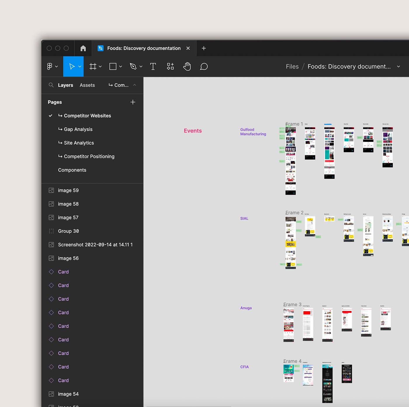
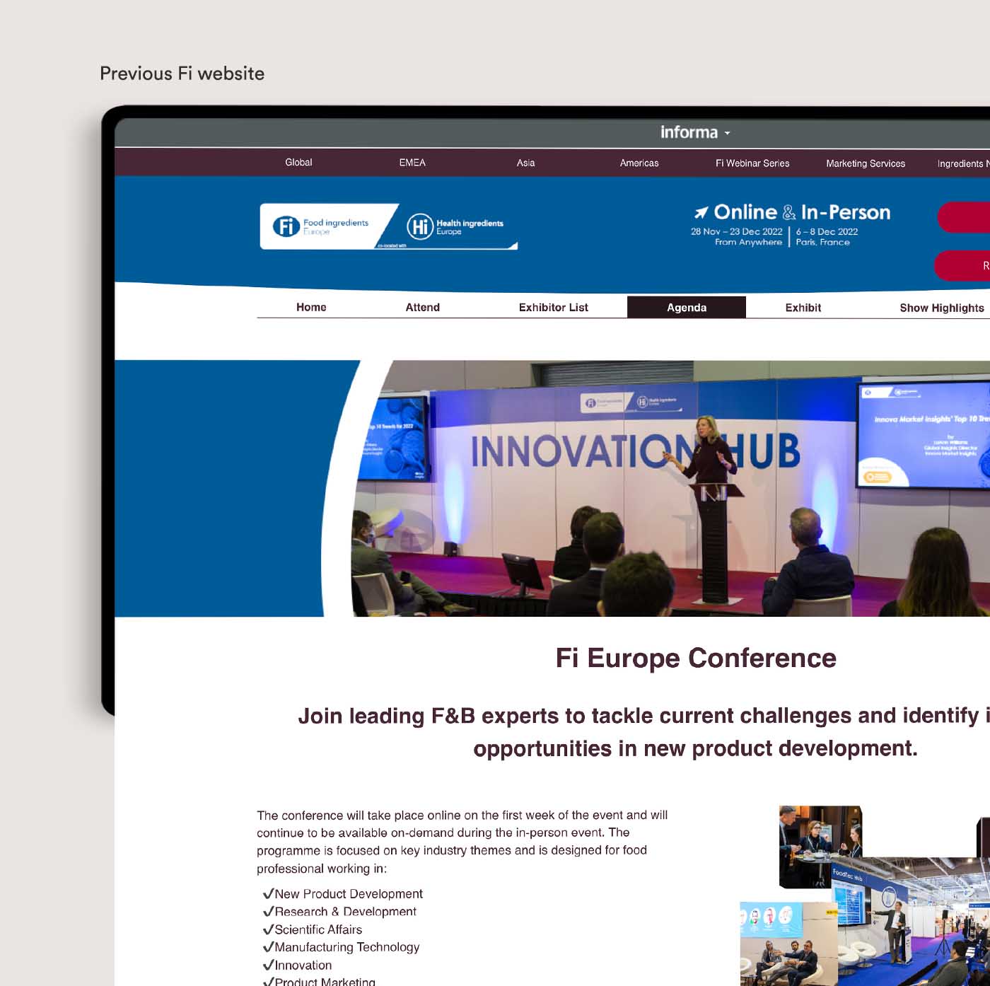
We began discovery by diving into an audit of the event’s existing website, as well as its competitors’.
It was essential for us to gain a deeper understanding of what customers were used to seeing, whilst also providing us with knowledge as to how we can improve that experience when it came to designing the Food Ingredients (Fi) event website.
For example, we wanted to provide more info around the city that the event was located in, to not only put customers at ease but also to build a sense of excitement. We also noticed that exhibitor pricing packages lacked clarity; we wanted these to be fully transparent to remove complications.
Who is this product for?
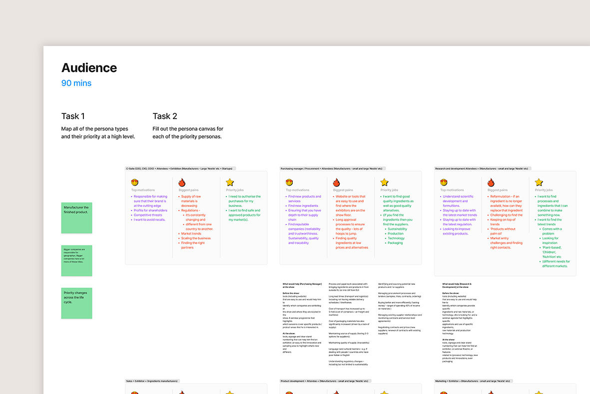
The inherent nature of events meant that there were several very different types of users we would need to cater for.
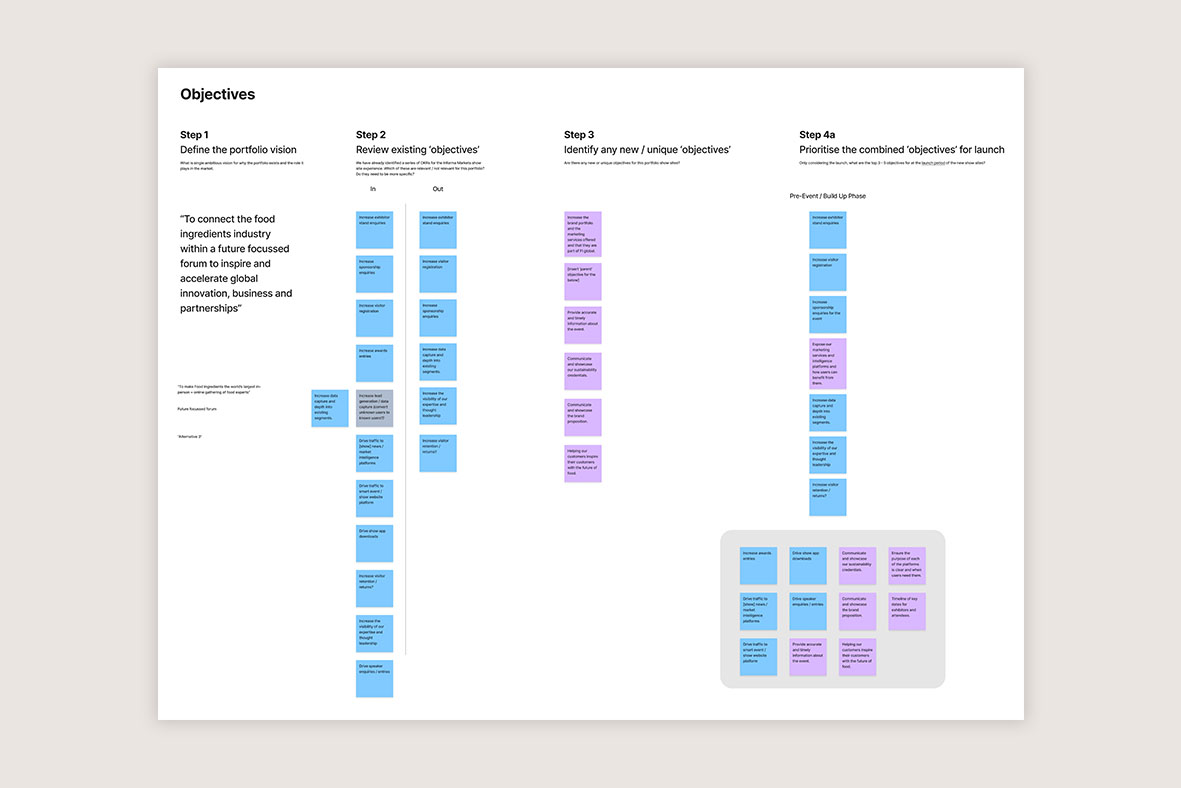
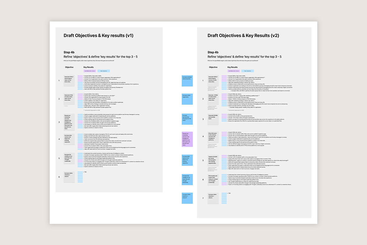
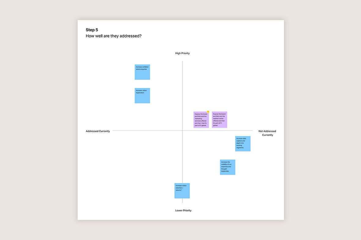
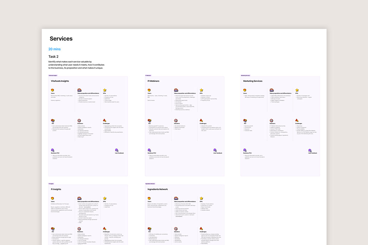
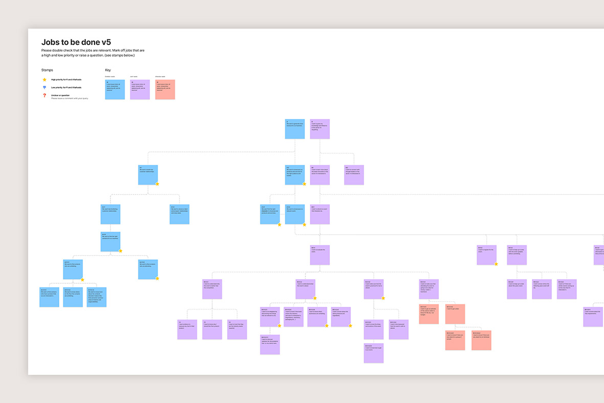
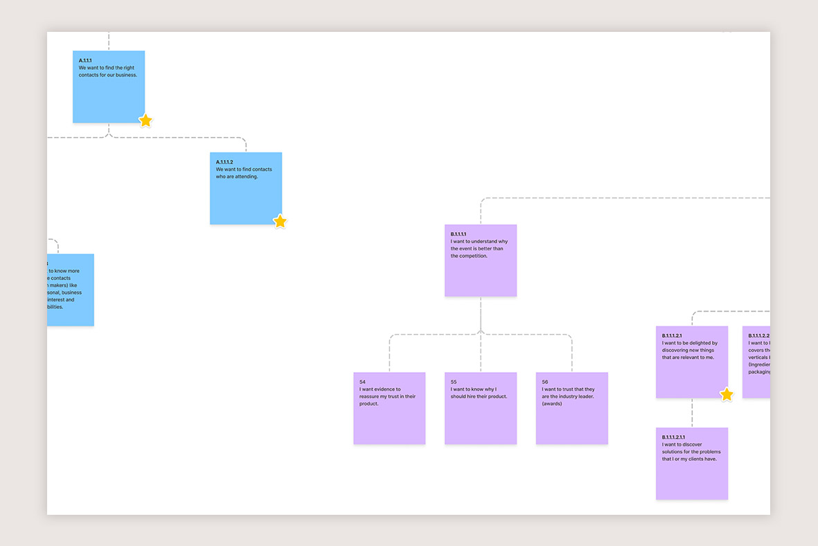
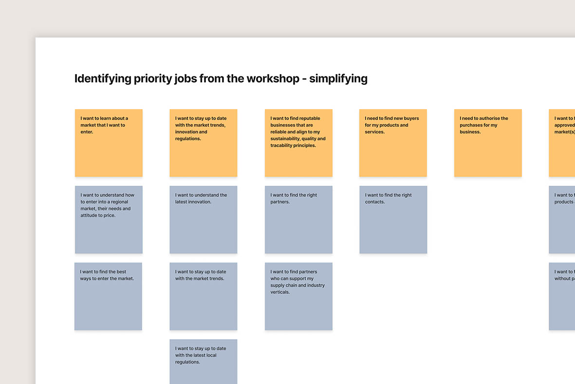
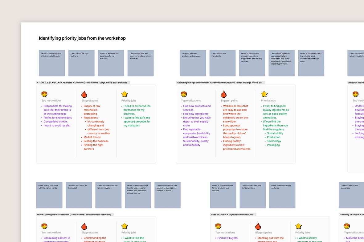
After outlining the website & business OKRs with Informa stakeholders, as well as the additional services that Informa offers, we dived deeper into the various user personas to understand their key motivations and pain points. We then scoped the jobs to be done (JTBD) – some of which were shared between the different types of users – and then attributed priority jobs to each persona.
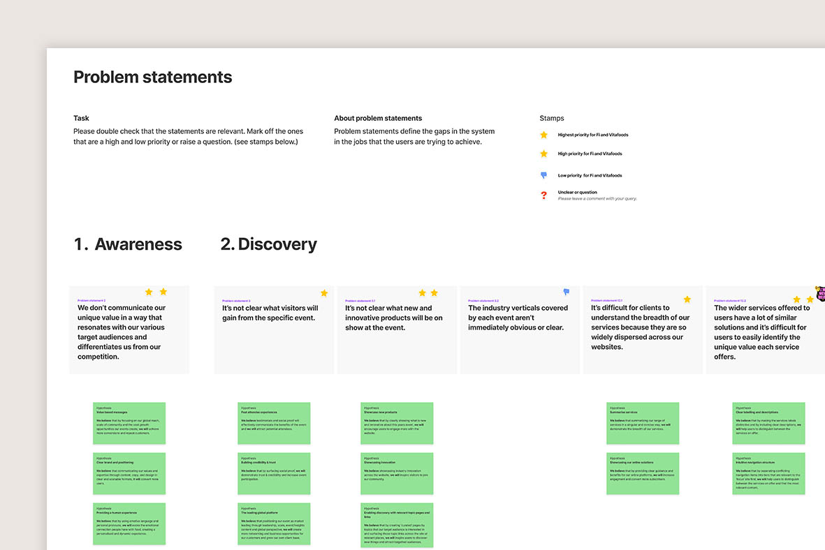
Our team had also been working on generative research by speaking directly to customers. Using this, we created problem statements and then aligned them with the lifecycle of a traditional customer; awareness, discovery, evaluation, intent, purchase & loyalty. We then prioritised these based on how integral they were to the JTBD, whilst also balancing them against the various OKRs and the services that Informa wanted to push.
Visualising content & user journeys
Ensuring users find the info they need, and in the order that they need it.
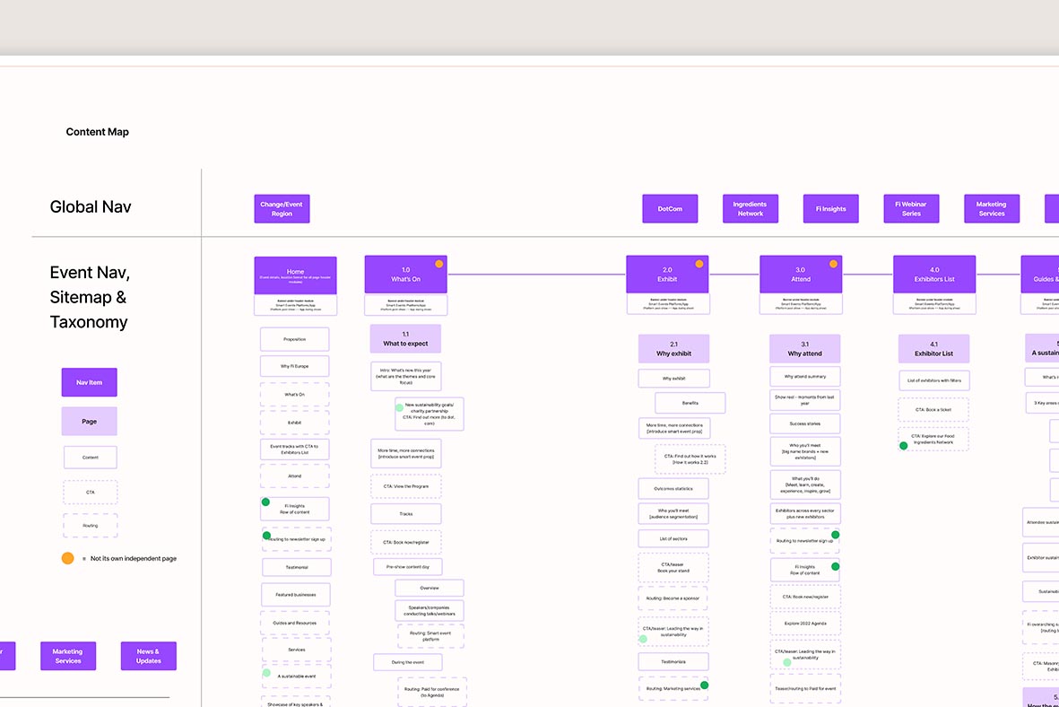
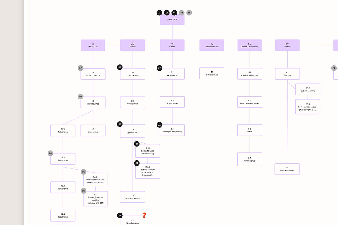
Collaborating with a UX writer & strategist, we worked on creating a sitemap & content map for the regional event sites. Simultaneously we also identified key journeys that the different types of users would take, and then ran these past the content map to ensure we were delivering on the JTBD, problem statements and OKRs.
This allowed us to quickly spot areas for improvement by modifying page structures or priority of modules on those pages. We also considered other relevant Informa services that we could up-sell users on; for example, if exhibitors will be showcasing their products at an event, there’s a high chance they may also be interested in marketing services to boost their appearance prior to the show. Similarly with visitors, not only will a brand buyer want a ticket for the event, but they’ll also likely want to join a year-round online network that connects brands with suppliers.
For tastemakers & trendsetters
Perfecting the brand direction
Informa wanted their Fi event to be at the forefront of the industry, attracting tastemakers from across the food & beverage sector.
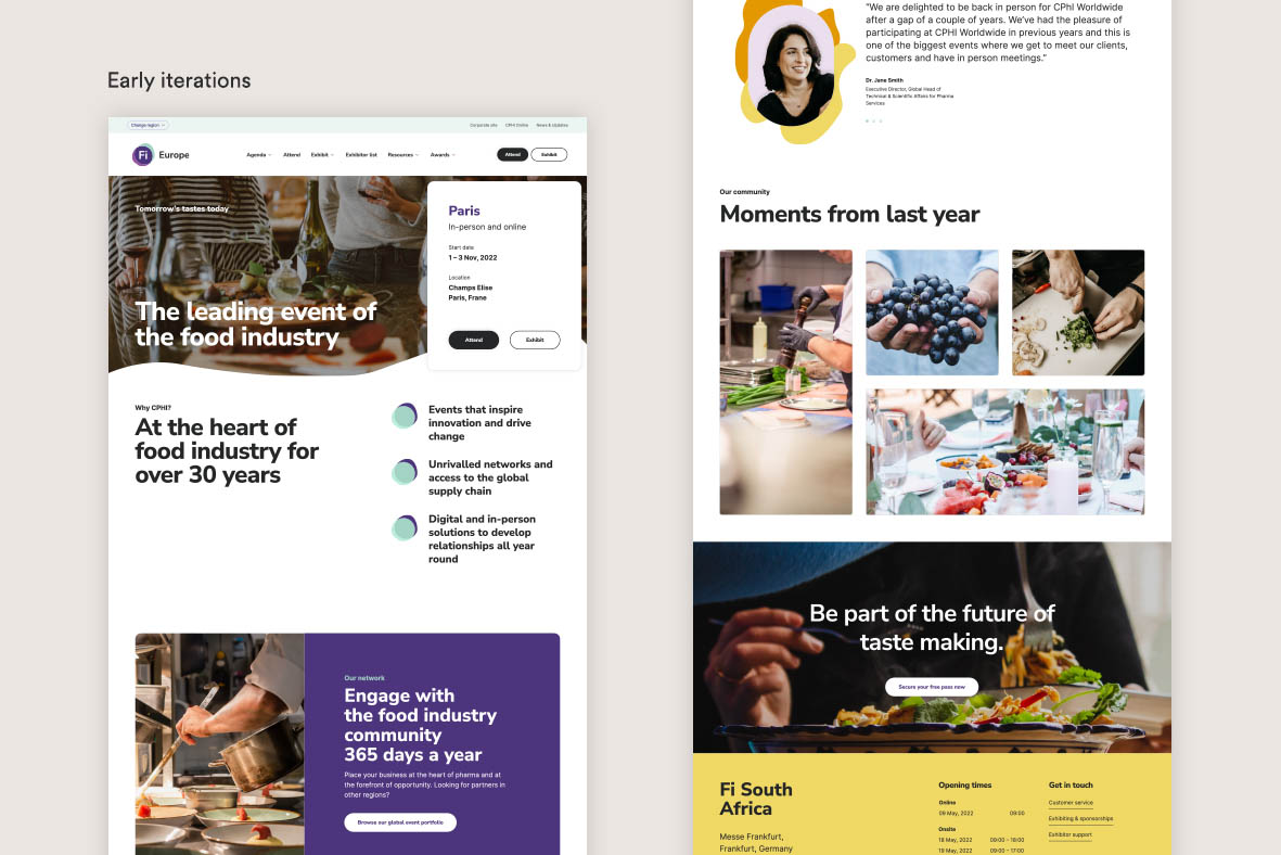
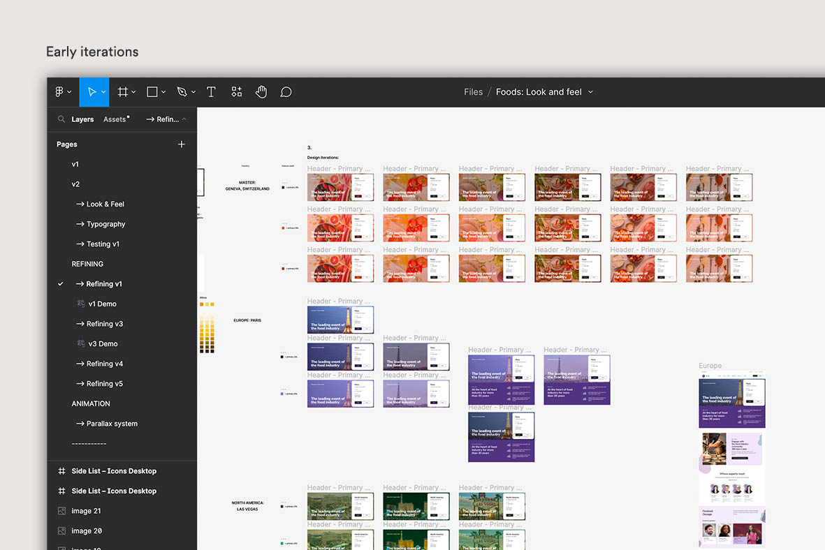
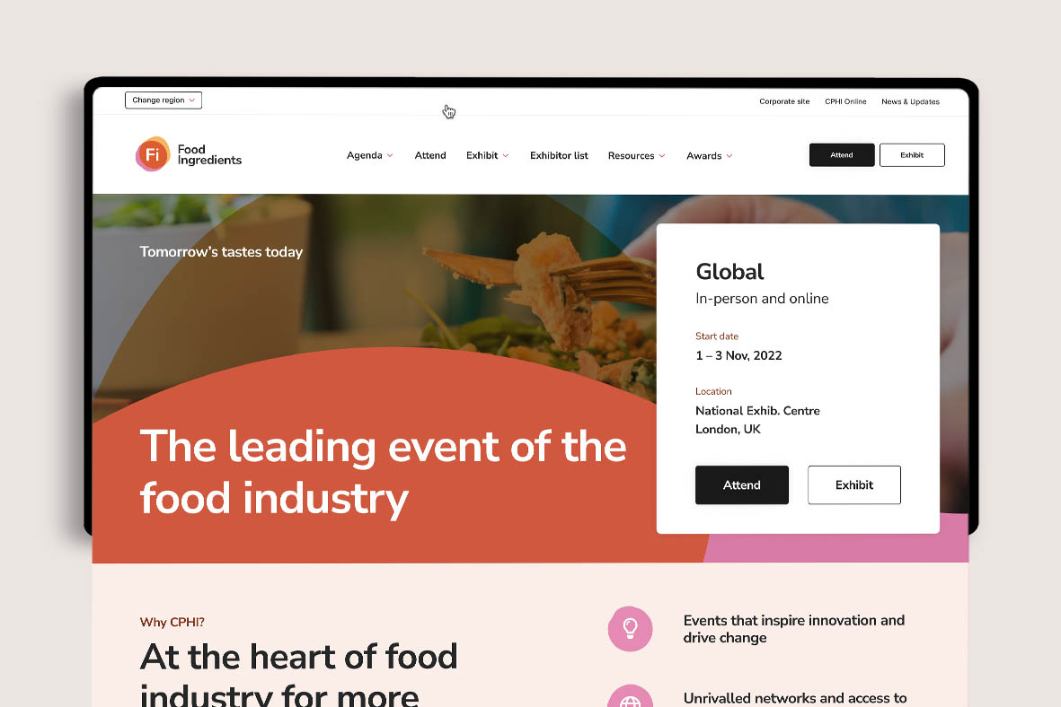
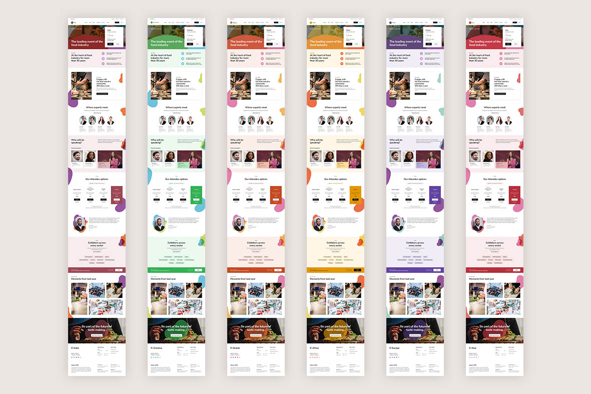
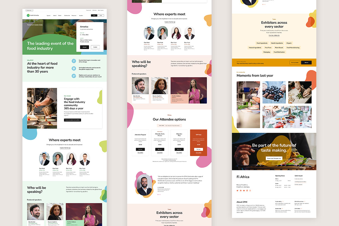
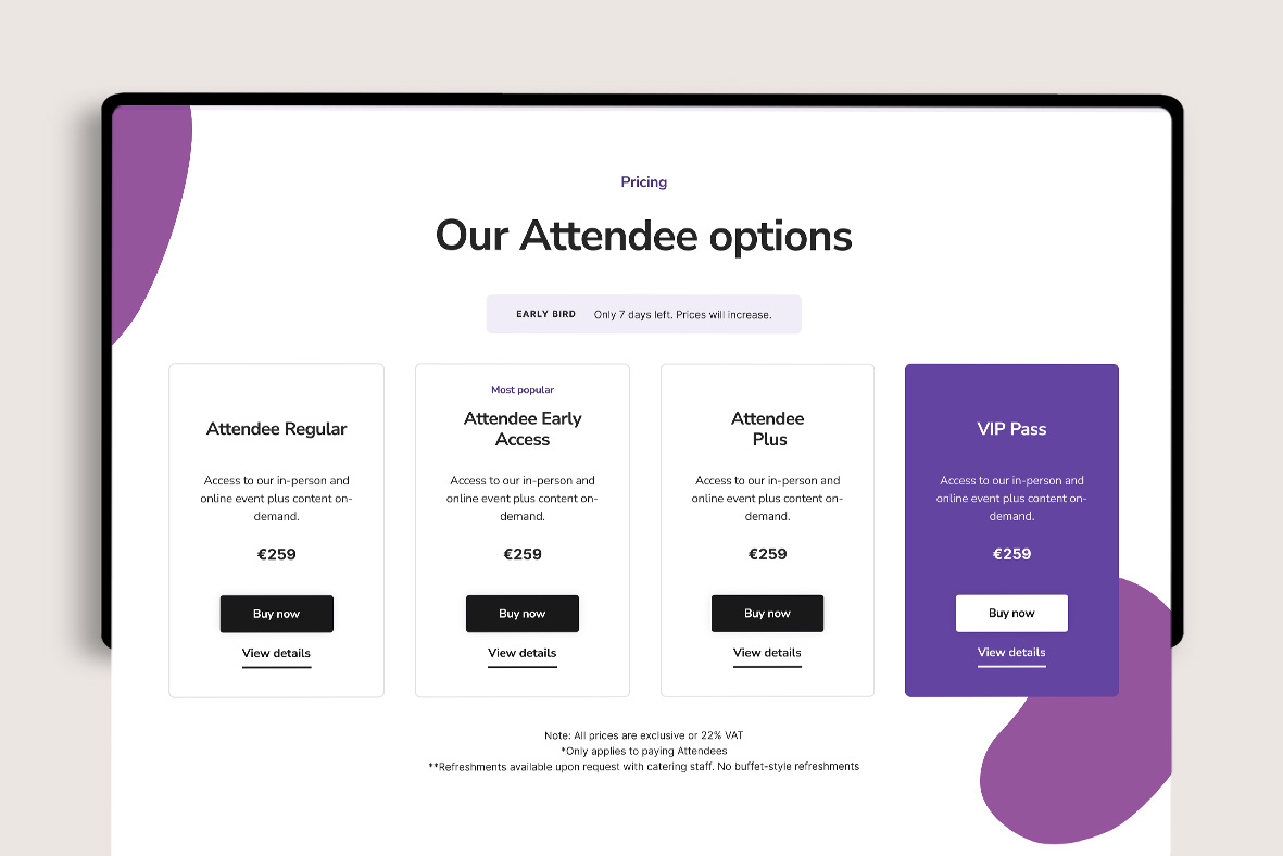
Informa’s existing websites felt very corporate and each region looked almost identical, nor did they give you that feeling of excitement or anticipation that they should have done. We wanted to give each region its own individual ‘look’, while still retaining a consistent brand direction across all nine websites.
How did the aesthetic evolve?
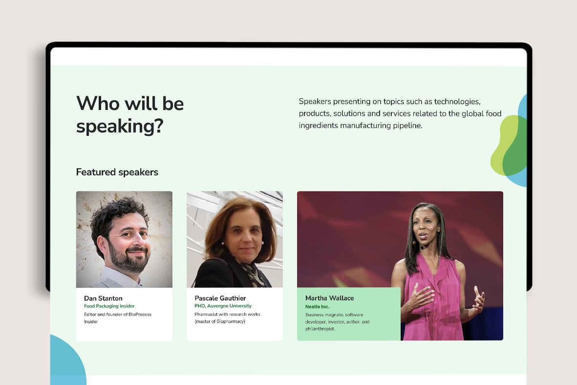
Exploring the use of colour, as well as how best to incorporate Informa’s lovely ‘organic shape’ brand assets, presented us with our first challenge.
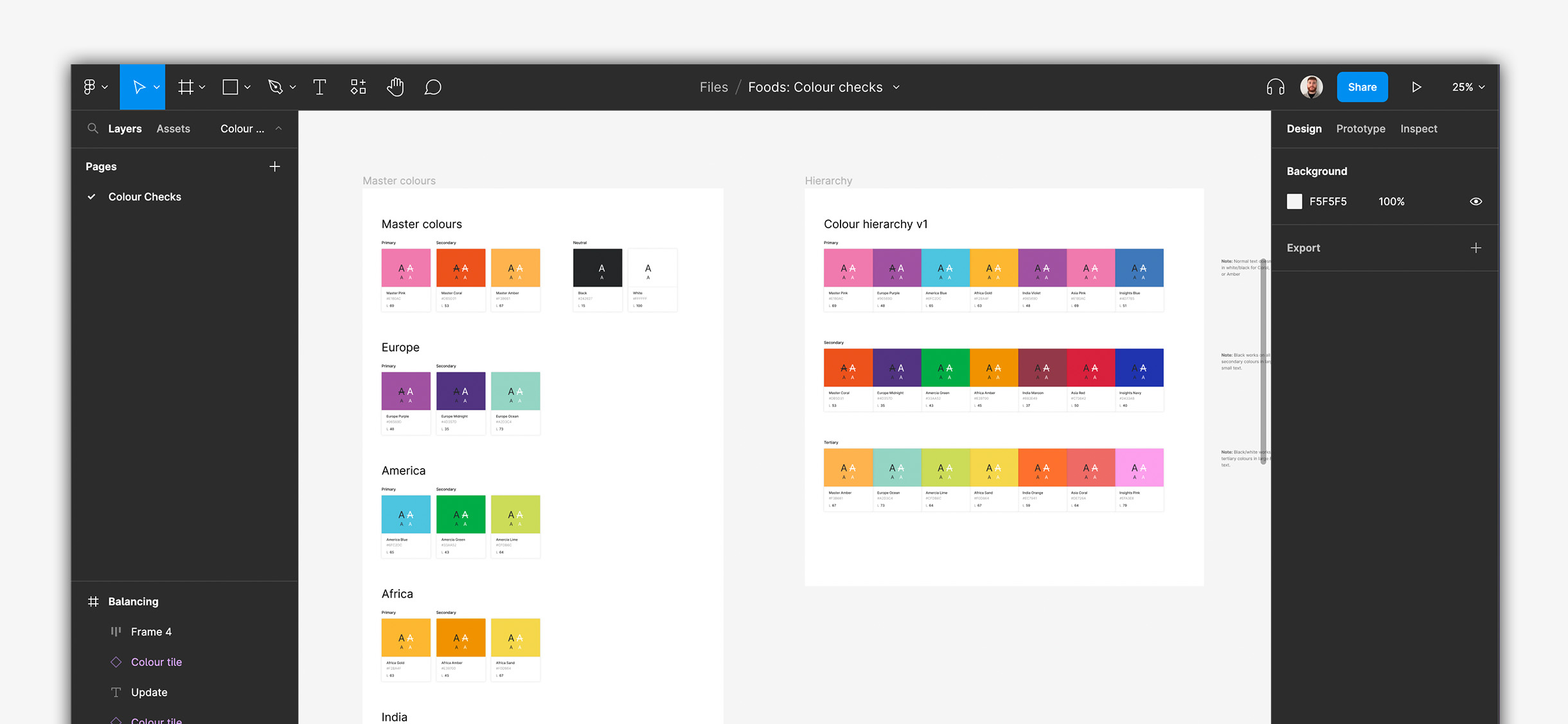
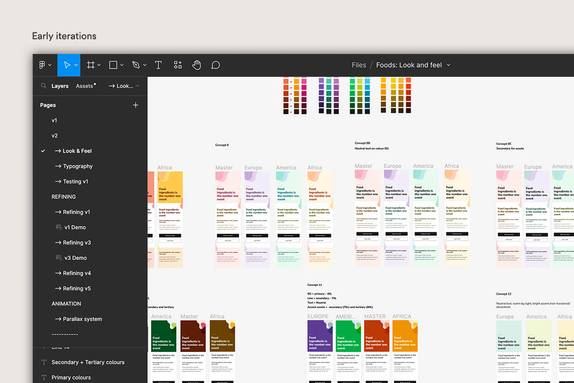
We needed to ensure that the colour palette used for each region passed accessibility standards, brought out just the right amount of character, and felt consistent across each of the nine regions.
I’ll go into a bit more detail in the next section as to how we accomplished this from a technical perspective (and managed to save 100s of hours of design time), but there was an array of things we needed to consider. We worked up a few ideas, one with a large amount of colour and one very minimal with splashes here and there, but neither felt quite right. We also toyed with the idea of using a darker tone of a region’s primary colour for text and CTAs, but these blended in with the background too much and the text was a nightmare to get consistent from an accessibility standpoint.
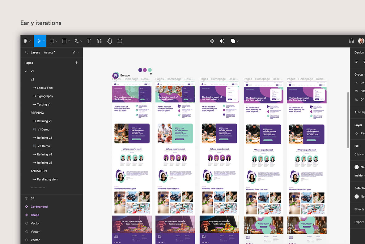
Alongside this we considered how/if the brand assets should be overlaid onto images, as well as how they appear on different colour background and how they work across different breakpoints. We wanted to replicate the Fi event logos with the overlapping shapes and mocked up how we could replicate this from an interaction perspective by using a parallax scroll (which worked a treat).
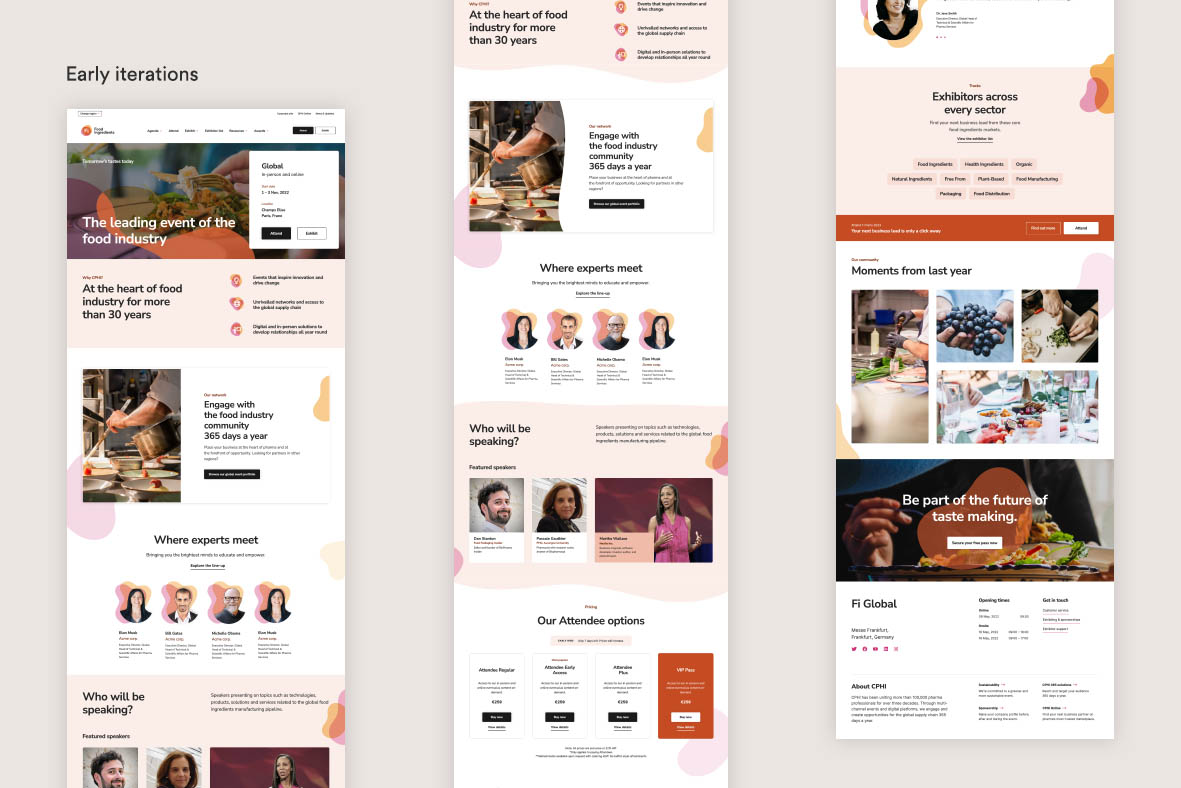
After several rounds of iterations and playbacks to Informa stakeholders, we signed off of a direction that we all felt perfectly summed up the character of the Fi event. It was clean, colourful, and oozed personality, while still maintaining just the right balance of friendliness and professionalism that an event of this nature should wield.
A future-proof design system
Once we signed off on the brand direction, I took the lead on setting up a headless, tokenised design system.
This system was to be used moving forwards across Informa’s global Fi event website ecosystem and so needed to be built on strong foundations. As I mentioned briefly earlier, due to the nature of Informa’s global presence, it posed a large challenge (both in terms of complexity and time) in ensuring consistency across all of their Fi event websites. And it was for this reason that we opted to use such a system.
Designing with the future in mind
The rationale behind ‘tokens’
Designing and styling modules for each event site in their region-specific palettes just wouldn’t have been a sensible use of time, and it most certainly would have resulted in human error beginning to creep in.
Off the back of the creation of our content map, we’d forecasted that we’d need to use around 50 individual modules for each site, which when multiplied across the 3 breakpoints, would total around 1,350 modules to be designed across all of the 9 regions.
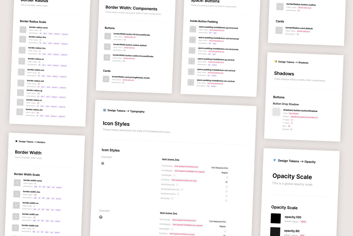
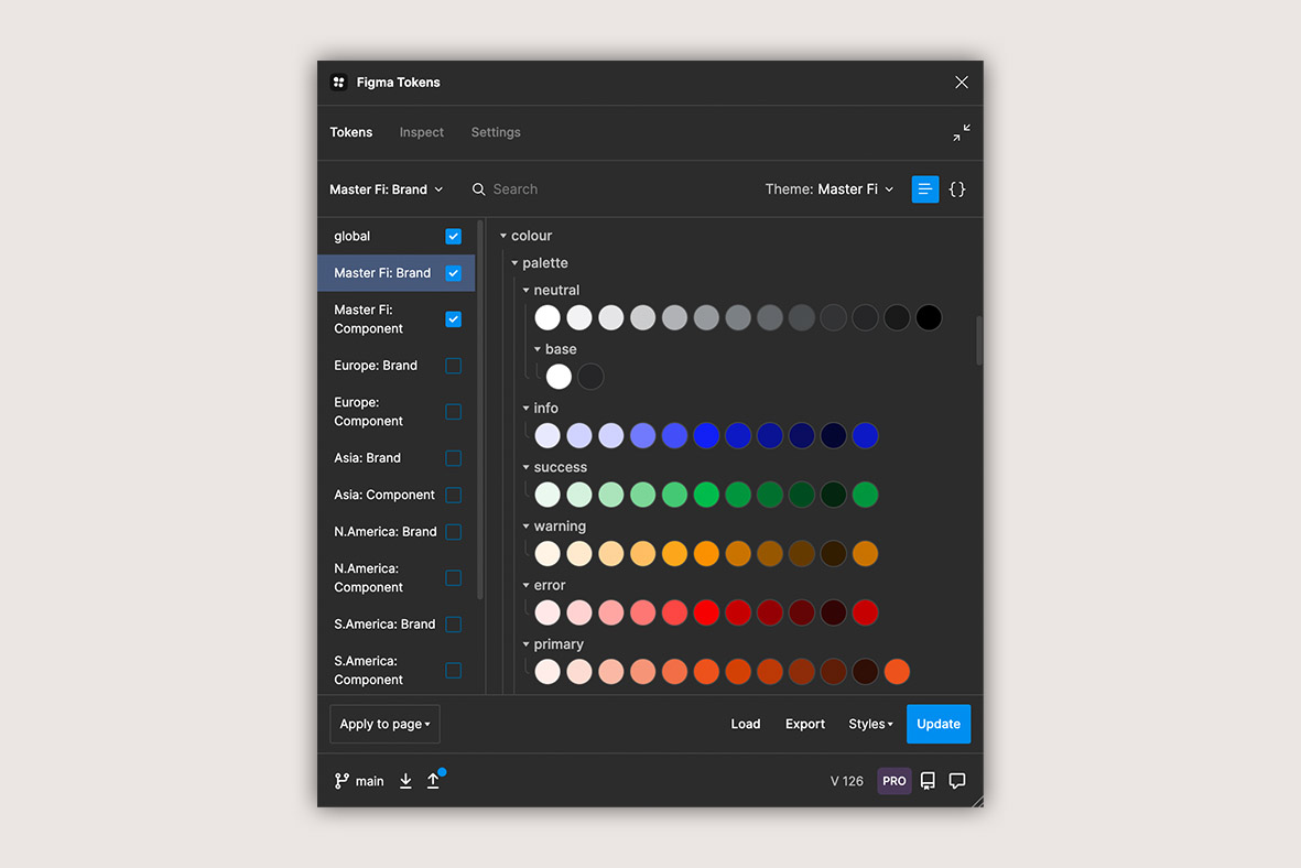
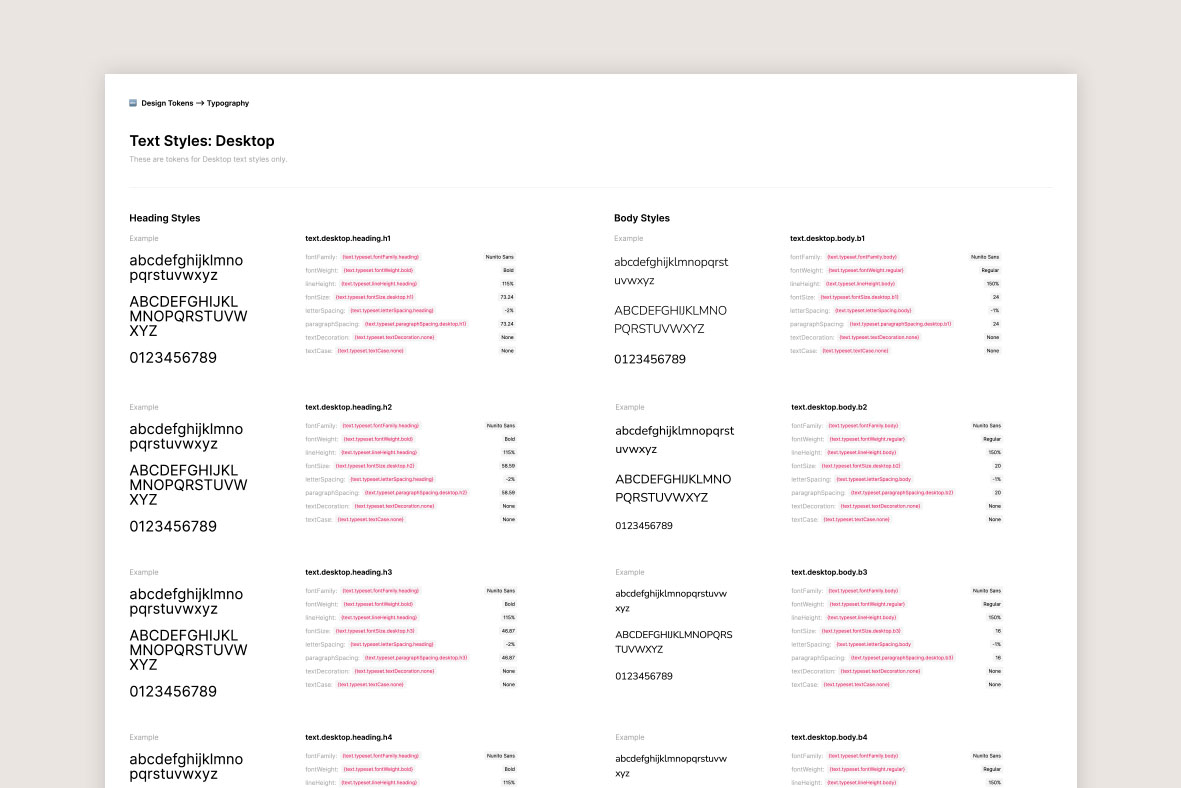
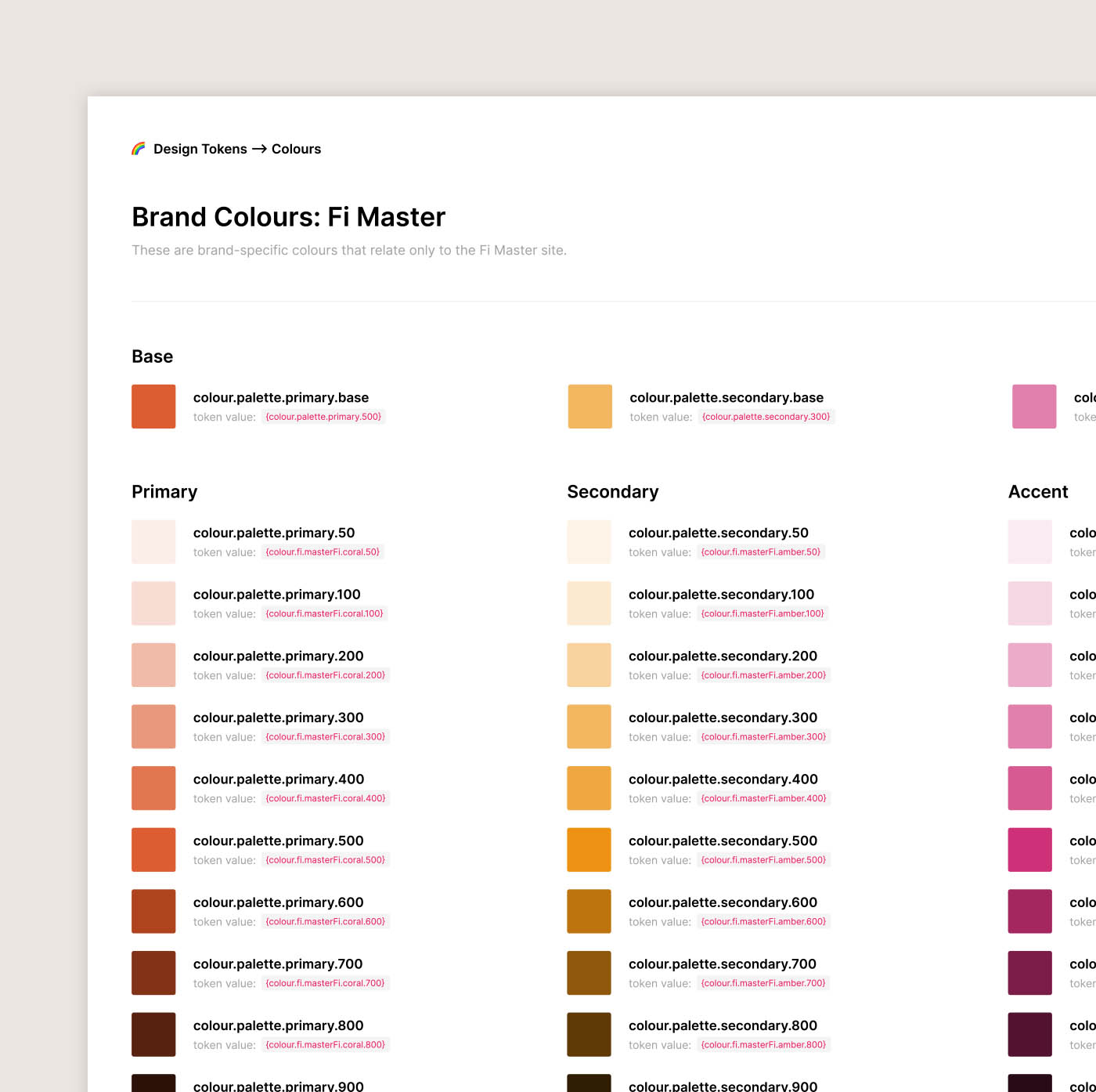
The token system essentially allowed us to set up and apply the tokens just once to all of the modules, and from there on out we could instantly toggle between the region’s palettes with a click of a button. It also enabled us to maintain consistency from a brand direction perspective, and made things such as testing for accessibility incredibly fast. Moreover, it gave us full control at a scale that just wasn’t possible within the native functions of Figma itself; we could now tokenise and have control over things such as colours, border radii, spacing, sizing, shadows and a lot, lot more.
It was also future-proof; should the brand direction, design or palettes ever change, we could quickly alter the look & feel of the modules by simply altering the values of the base tokens that we’d set up. These changes would then instantly trickle down into the various tokens at the region and component levels.